Mercury M2
Addressing an enterprise platform & tech stack
OVERVIEW
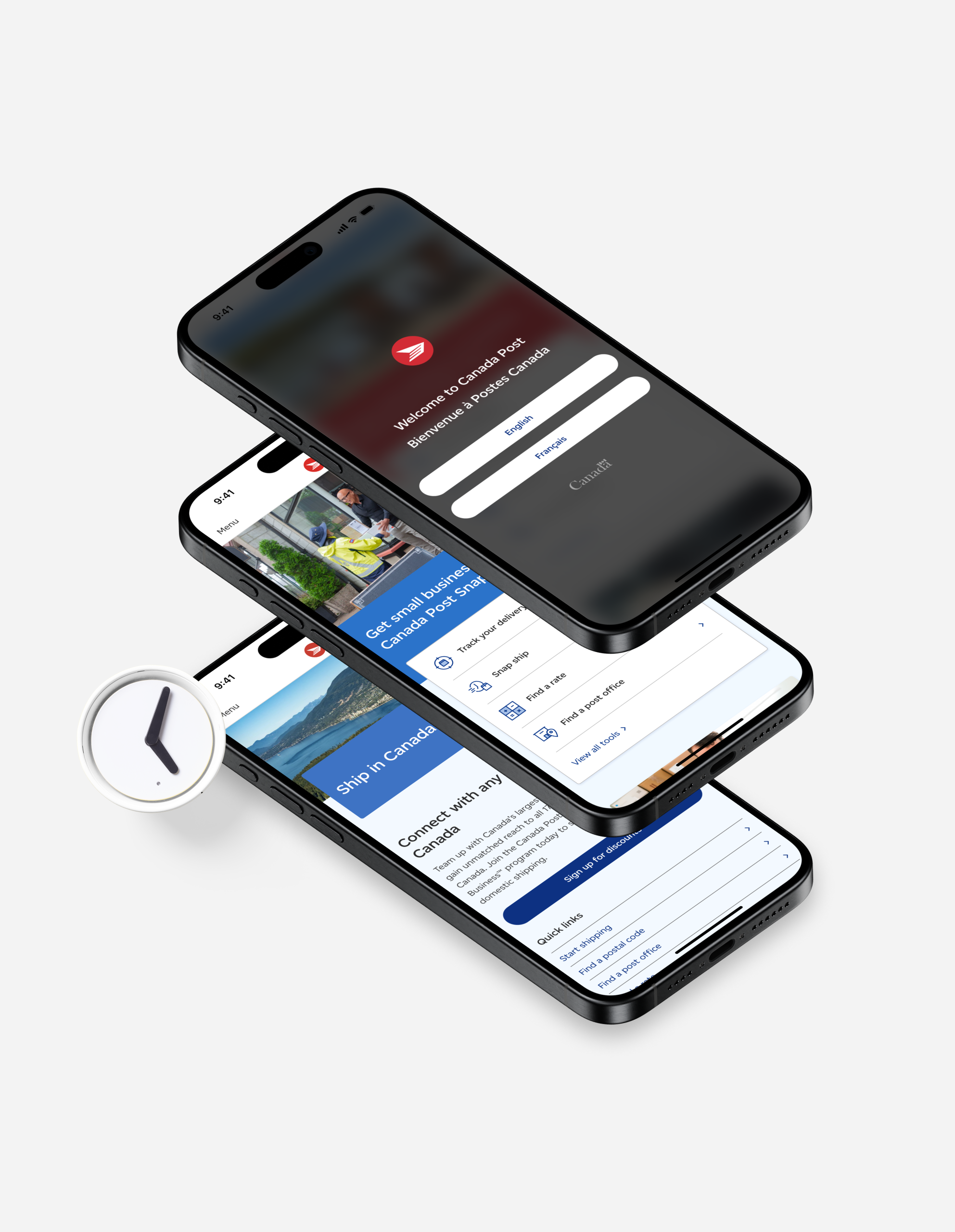
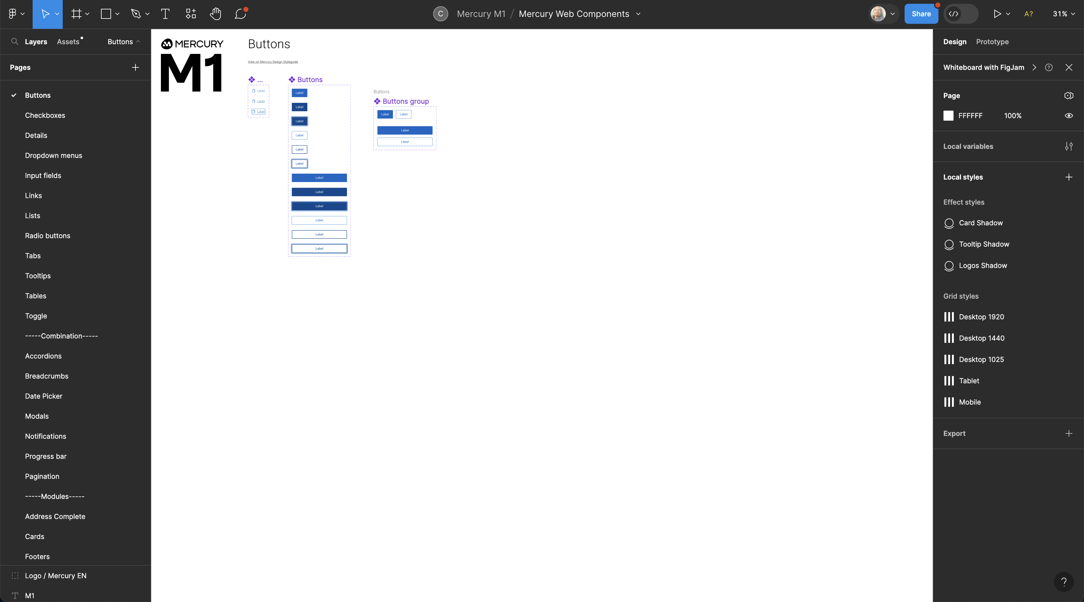
This case study delves into the development of Mercury M2, a tokenized Design System created for Canada Post. Over nine months, M2 was conceptualized and built, surpassing its predecessor, M1, in both scale and efficiency.
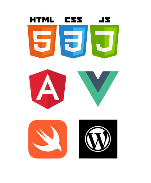
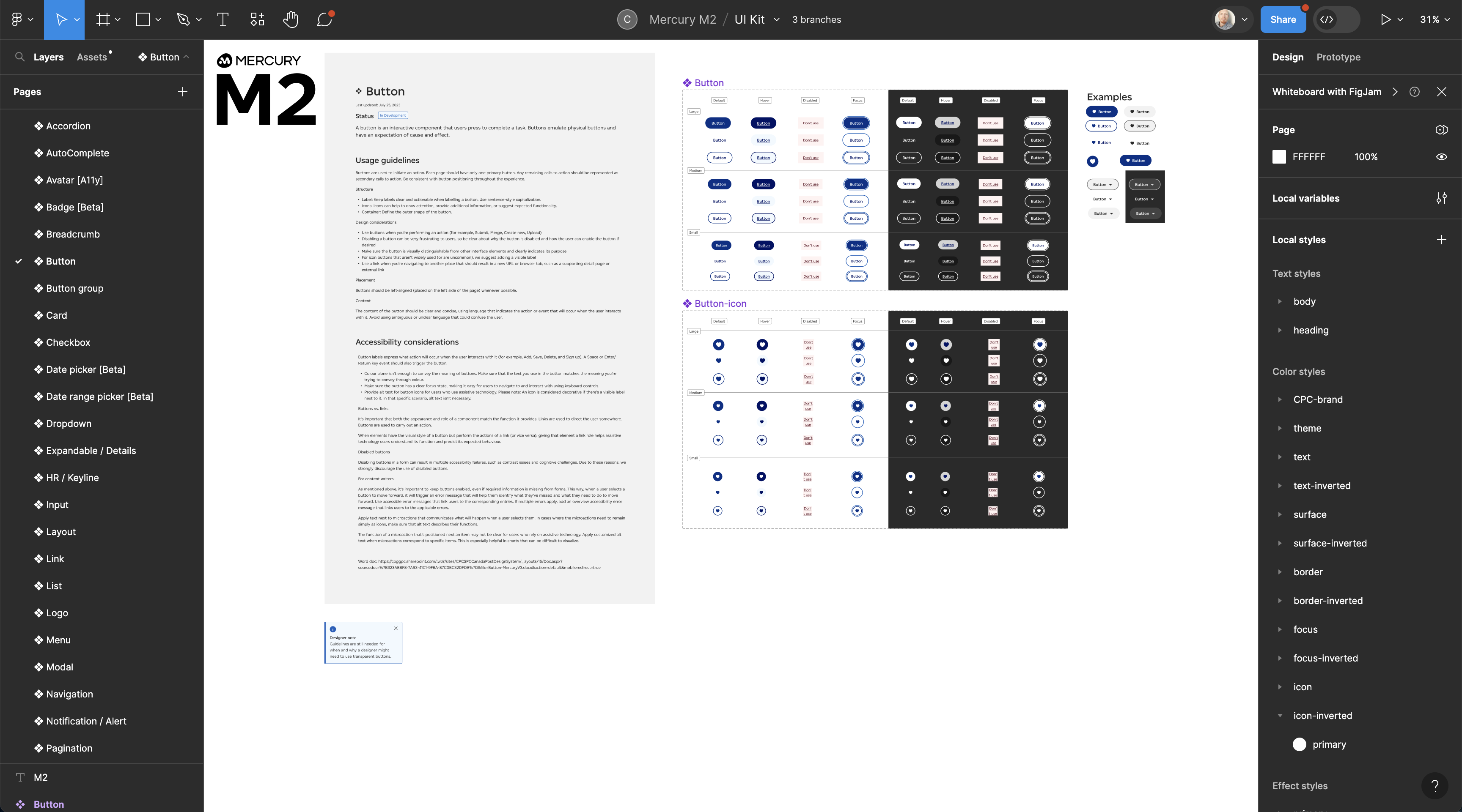
Utilizing a blend of technologies including HTML, vanilla JS, Angular, native iOS, native Android, APIs, and the Mendix framework. It includes nine tokens, over 50 components, 50 modules, 20 page templates, and 10 flows, along with comprehensive documentation through both a public-facing WordPress site and internal IP documentation site.
The Challenge
Canada Post faced challenges with the previous version, M1, including limited scalability, outdated components, and inefficiencies in the design process. The need was for a comprehensive, modernized design system that could cater to diverse platforms and technologies, ensuring consistency, efficiency, and adaptability in design and development processes.
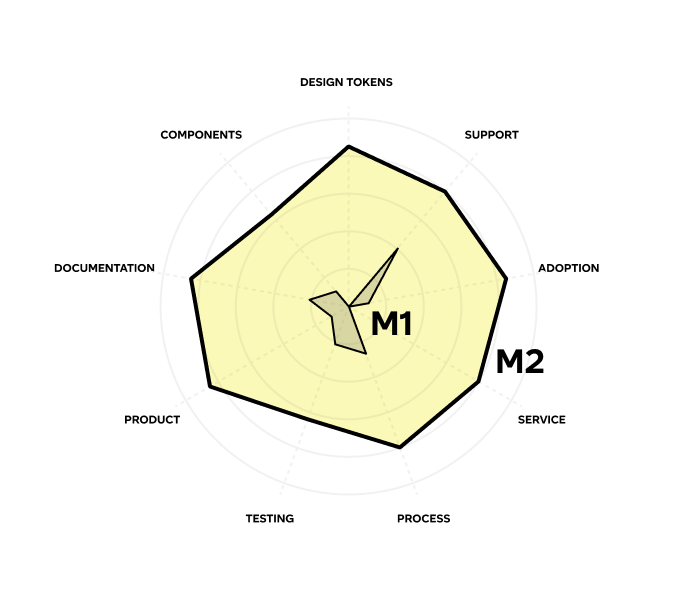
The goal for M2
10x M1
DISCOVERY
Extensive research was conducted to identify the pain points in the existing system and to understand the requirements of different platforms (web, iOS, Android) and technologies.
This research phase involved interviews with stakeholders, in-depth analysis of user feedback, and a thorough evaluation of technological advancements in design systems.
UPDATED BRAND
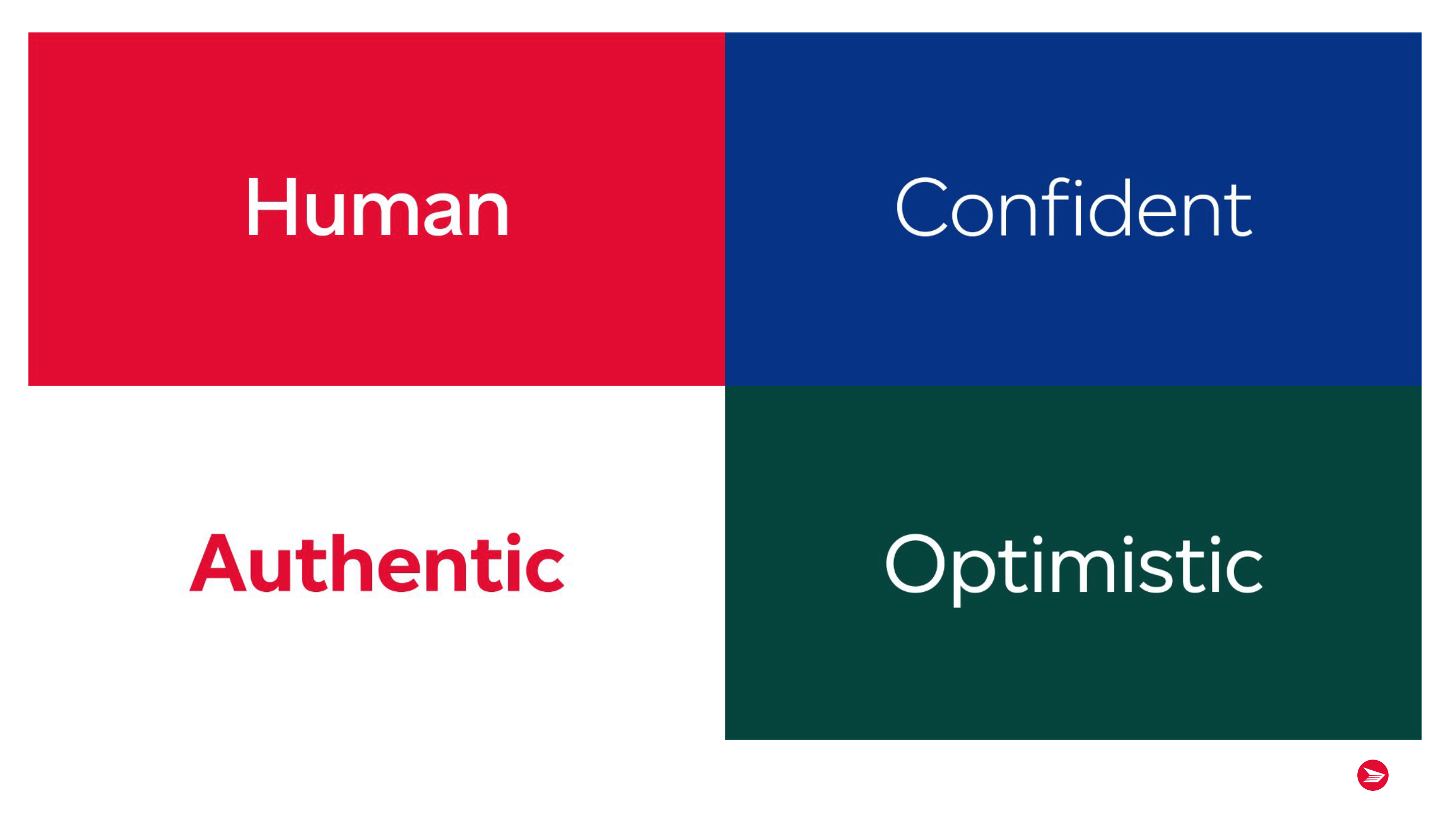
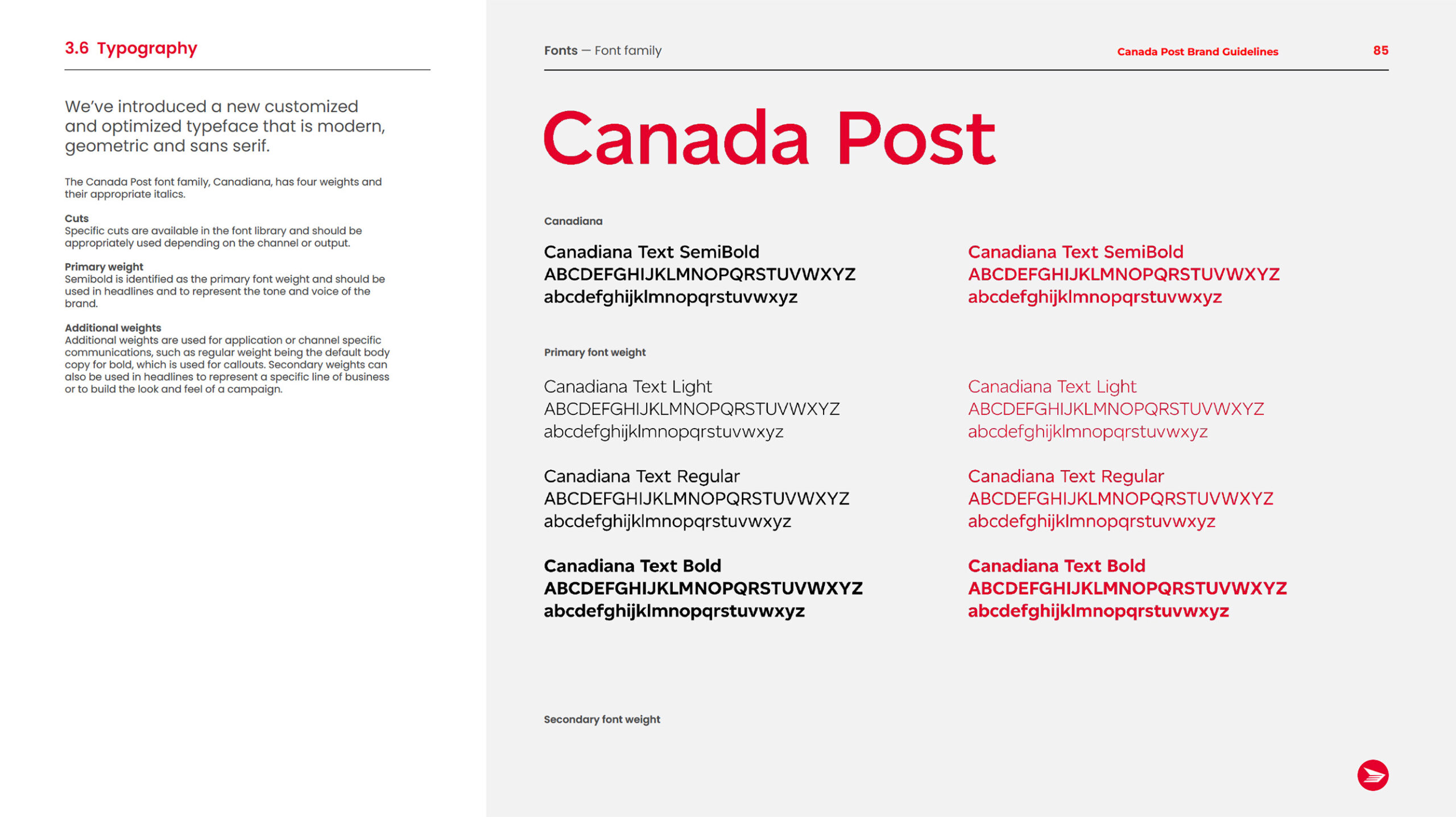
The new look and feel along with a revised brand strategy encompasses the purpose, the promises Canada Post delivers, as well as how they present ourselves to their audiences. It helps Canada Post shift the dialogue to better meet the needs of Canadians by making them the heroes of the conversation.

DESIGN SYSTEM

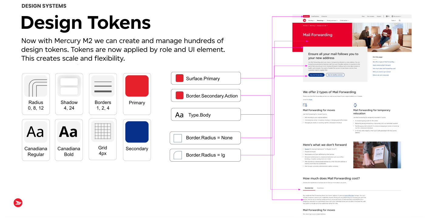
We digitized our new brand, strategy, and tone into a design system and launched it as a central source of-use

Goals:
- Utilize a shared language and repository
- Reduce redundancy
- Increase visual consistency
- Lower production costs
- Allow us to ship digital experiences faster
As a product, M2 will:
- Have guidelines and components for consistent design and user experience across public-facing interfaces and platforms.
- Have Light and Dark CSS JSON themes (token management) built for API, responsive web, and native mobile.
- Be used by all internal teams and 3rd parties.
- Have a decentralized contribution model, and
centralized governance model. - Be fully WCAG 2.1 AA compliant.
Tokenization Strategy:
Identified and developed nine core tokens that served as the foundation for consistent design elements across platforms.
Component and Module Development:
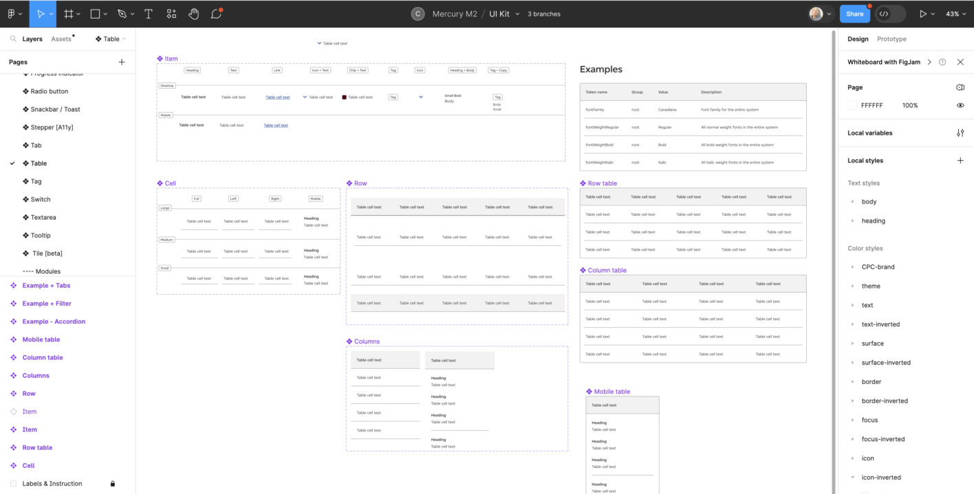
Created over 50 components and 50 modules, ensuring modularity and reusability to streamline the design and development process.
Platform-Specific Adaptations:
Customized components and modules for native iOS, native Android, HTML, and Angular, ensuring optimal user experiences on various platforms.
SOLUTION
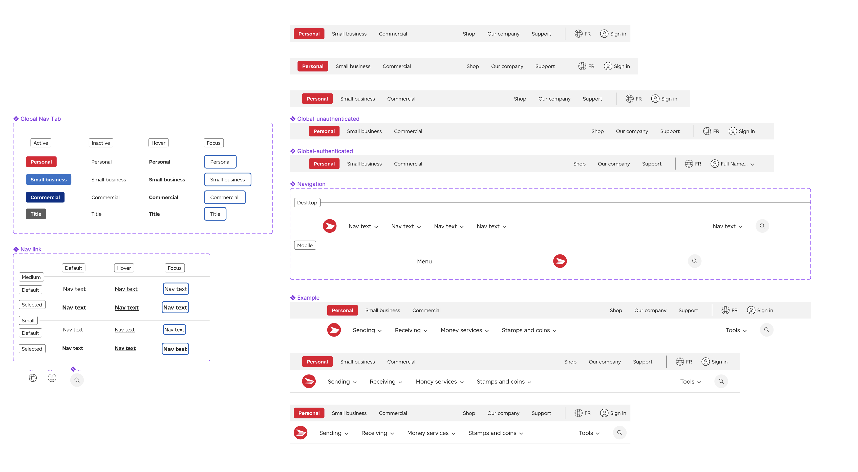
Unified Design Language
Established a cohesive design language across platforms, ensuring consistency in visual elements, interactions, and user experiences.
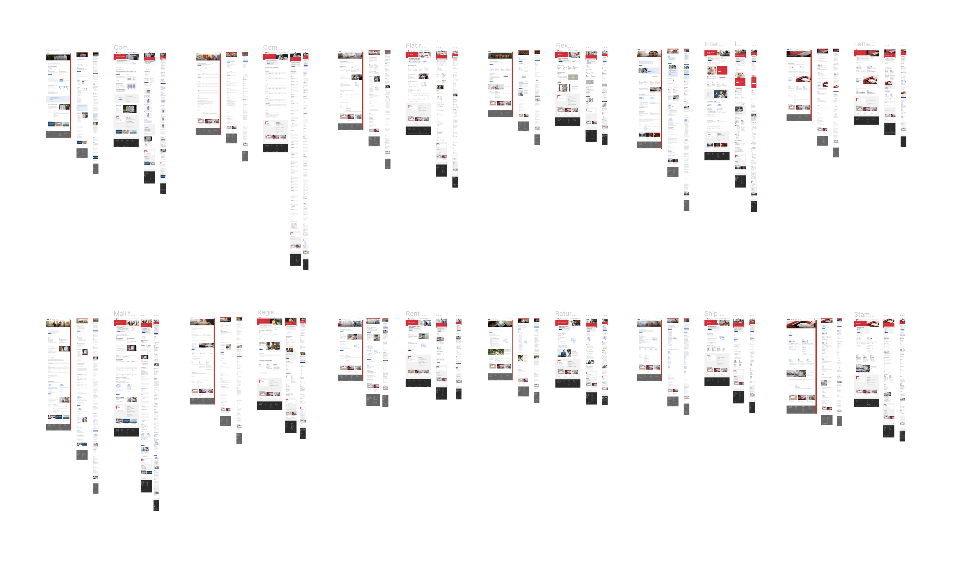
Comprehensive Documentation
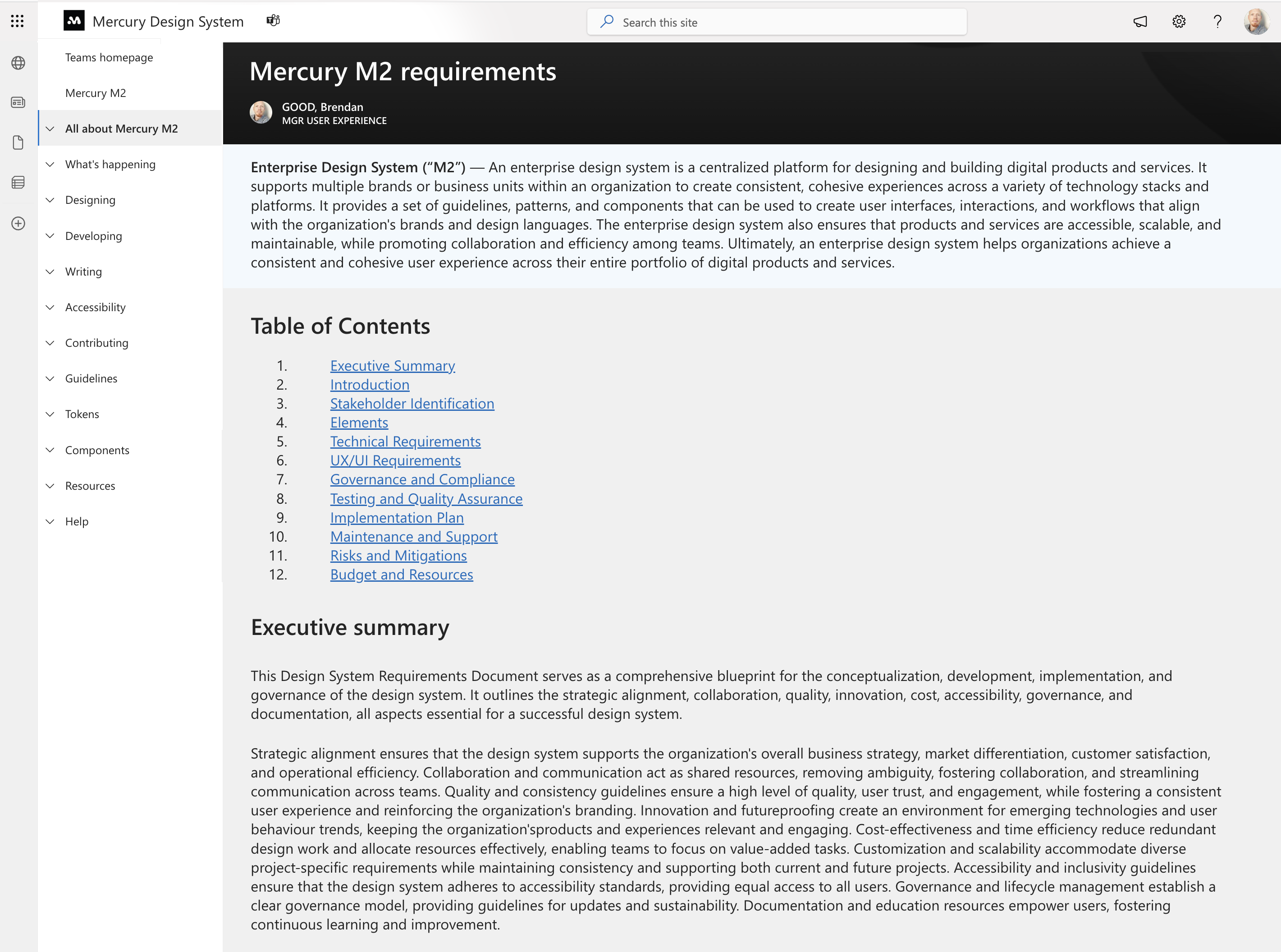
Comprehensive Documentation: Developed detailed documentation using WordPress for external users and an internal IP documentation site for in-house teams, facilitating seamless onboarding and reference.
Scalable Architecture
Built a scalable architecture across 6 frameworks, allowing easy integration with existing systems and future expansion.
RESULTS
-30%
Production Costs
+40%
Shipping Speed
+80%
Team Adoption Rate
Mercury M2 was implemented successfully across Canada Post’s digital platforms, showcasing a significant improvement over M1. The tokenized approach ensured consistency, enabling rapid development cycles and reducing design and development overhead. The design system’s modularity and scalability paved the way for effortless integration with various technologies, leading improvements in efficiency and notable design & dev team satisfaction.
"Mercury M2 has revolutionized our design and development processes. Its scalability and adaptability have made a significant impact on our efficiency, allowing us to deliver high-quality user experiences across platforms."
- Lisa, Project Manager
"The comprehensive documentation provided with Mercury M2 has been invaluable. It not only facilitated a smooth transition but also empowered our teams to explore the full potential of the design system."
- Michael, Developer
REFLECTION
This project highlighted the importance of adaptability and versatility in design systems. The combination of tokenization and platform-specific customization proved to be a powerful strategy, ensuring consistency while catering to the unique requirements of different platforms. Collaboration among multidisciplinary teams was key, emphasizing the need for open communication channels and knowledge sharing.
Key Takeaways
Modularity and Scalability:
Modular design and scalable architecture are essential for accommodating diverse platforms and technologies.
Comprehensive Documentation:
Detailed documentation is crucial for onboarding, reference, and ensuring consistency in implementation.
Collaborative Approach:
Open communication and collaboration among cross-functional teams are vital for the successful development and implementation of a design system.
User-Centric Focus:
Prioritizing user experience and adaptability ensures that the design system meets the evolving needs of end-users and stakeholders.
Other Case Studies
